Dashboards and custom reports: refreshed UI for a more consistent experience
What changed
- Dashboards now have a more polished look and feel. The header, navigation, breadcrumbs, side panel, and modals all follow the same visual style so the experience feels consistent as you move around.
- Every chart and widget type (numeric, bar, donut, line, table, funnel, and more) now uses the same loading states, error states, and card styling, so data tiles behave and look aligned across your dashboards.
- Advanced filters, the quick filter panel, and the date picker now share the same visual language in both dashboards and custom reports, making them easier to recognize and use.
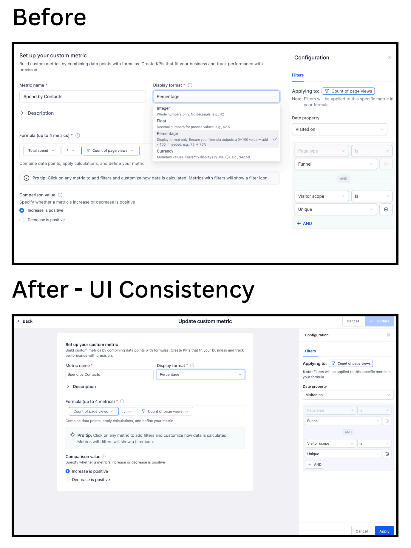
- The custom metric builder, including the formula builder and filter panel, now has a cleaner, more structured layout that makes it easier to scan and configure complex metrics.
- The report builder, report list, schedule page, and clone/duplicate flows are now visually aligned from start to finish so building and managing reports feels like one continuous experience.
- Widget AI summary, as well as Google Ads, Facebook, and Google Analytics widgets, are all included in this visual refresh so third-party data tiles match the rest of your dashboard.
How it works
- Go to Settings → Labs in your EveryCatch account and turn on "Dashboard and custom reporting – UI consistency update" to start using the refreshed experience.
- Once enabled, the updated UI will load automatically whenever you open Dashboards or Custom Reports. There is nothing extra you need to install or configure.
- All your existing dashboards, reports, widgets, filters, and custom metrics stay exactly the same in terms of data and logic. Only the visual presentation is updated.
- If anything looks off or unexpected, use the feedback button directly from the dashboards or reports area to share details with the team.
Why it matters
- You get a more consistent experience across Dashboards and Custom Reports. Layouts, components, and controls now follow a shared visual system, so moving between pages feels more predictable.
- You see fewer visual surprises. Spacing, typography, dropdowns, and tooltips are aligned across components, so elements match from one page to another.
- This upgrade provides the foundation for faster, safer improvements to Dashboards and Reporting in the future, since new features can reuse the same unified components.
Notes
- This is a UI consistency update, so no underlying functionality, data, or workflows have changed. If you have added custom CSS styling to dashboards or reports, you may need to adjust it to align with the new components. We recommend reviewing your dashboards’ visual styles after enabling the update to confirm everything still behaves as expected.
- You may notice small spacing differences in certain areas. These are intentional changes as part of aligning components to a single visual system.
Screenshots
Custom report builder
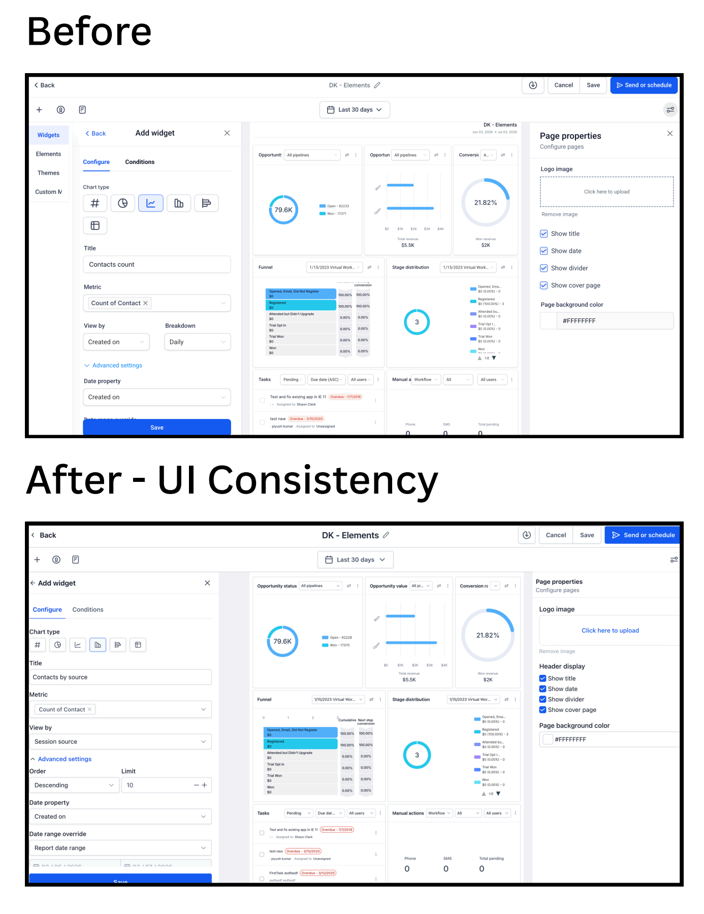
The refreshed custom report builder brings filters, columns, and configuration controls into a cleaner, more consistent layout so you can scan and adjust report settings more quickly.
Custom report - scheduler
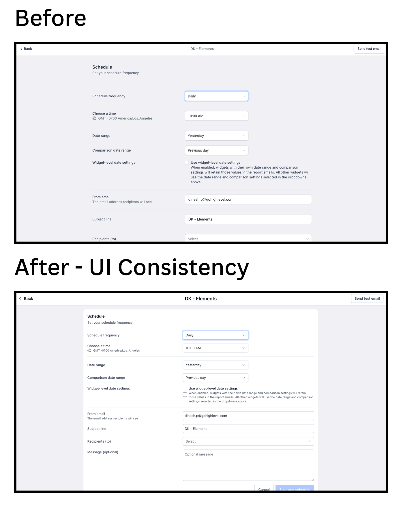
The scheduling view now matches the rest of the reporting UI, making it easier to set up, review, and manage scheduled report deliveries without visual jumps between pages.
Dashboard builder
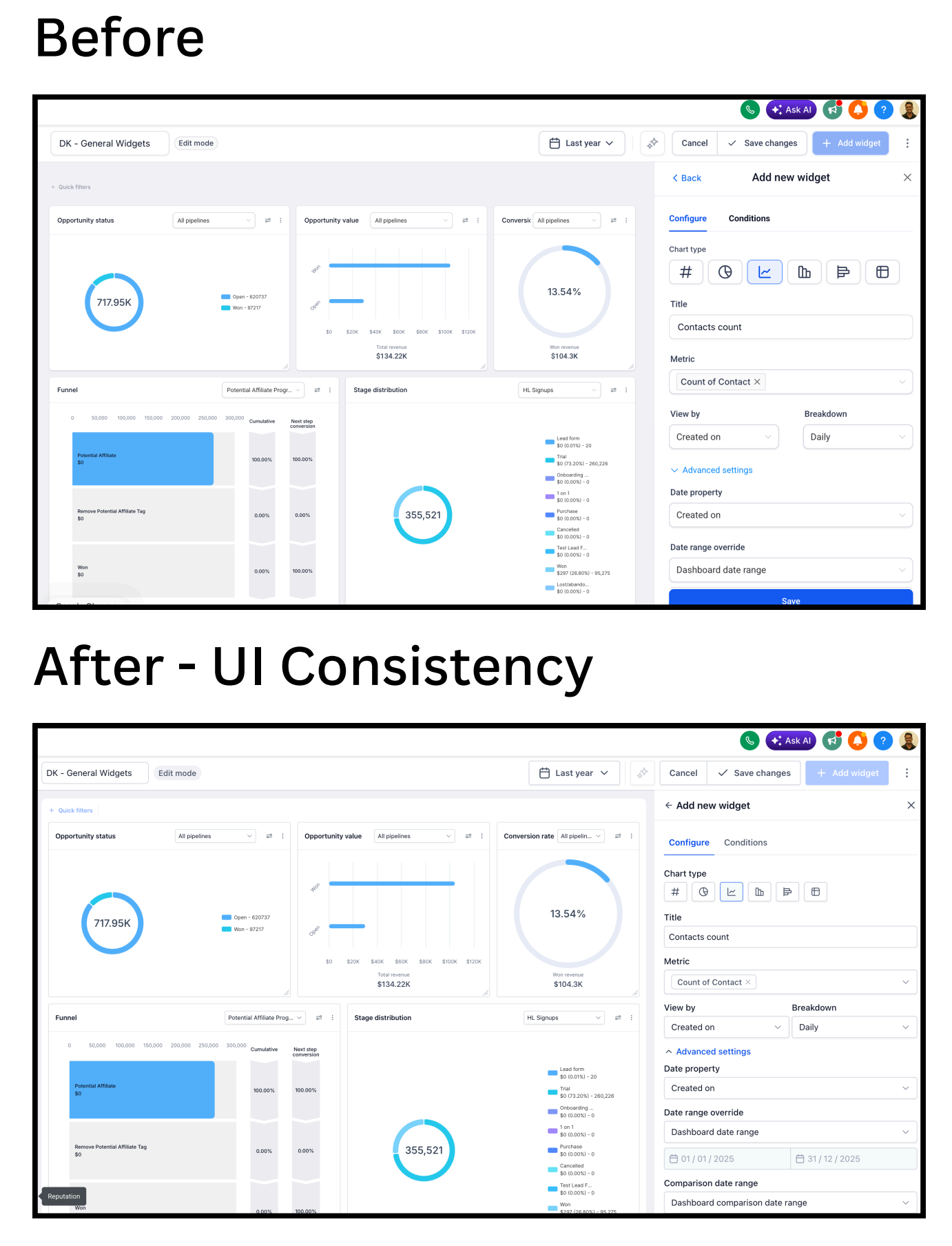
The dashboard builder now uses unified cards, panels, and controls, so adding, resizing, and arranging widgets feels more streamlined and visually consistent.
Custom metric builder
Need help with this?
If you'd like help setting this up or want to know what it means for your account, book a quick call and we'll walk you through it.
